ResBaz
What is it?
RezBaz or Research
Bazar was a 3 day workshop organised by some
really wonderful people and held at the University of Melbourne. The aim was to teach ECR's new
technology skills for their research.
I love
this idea because as a PhD student I'm often overwhelmed by the huge
range of software and technology available for the things I do and
don't quite know where to start with learning them.
How does it work?
The workshop
involved
multiple streams running concurrently, teaching R, computer
aided design and 3D printing, python, MATLAB and more. So many useful tools were being taught that many of us wished we could take multiple streams.
The other really great thing about ResBaz was that the tutors and attendees were researchers from all disciplines giving lots of different perspectives and areas of expertise.
Oh and did I mention it was free? Including the food, really good food.
Wait, you're not talking about spiders... what this blog is about?
I was in the Resbaz mapping stream. I have to admit I'm very much a mapping novice, before last week the best I could do was play around with Google Earth and maybe get some data into ArcGIS if I was lucky. So what I wanted to do in this blog is give you a little overview of what I learnt (as much for my sake as yours!).
Huge thanks to our tutor Steve Ben
nett (@stevage1) who did an amazing job (he may even share his slides with you if you ask nicely), Lachlan (@datakid23) for helping out and to the guys from @aurin_org_au for explaining their great database.
CartoDB
What is it?
A great online tool
for quickly and easily visualising data on maps. Got a presentation
where you want to show population numbers in different areas or the
layout of different field sites?
CartoDB can do that quickly and make
it look good!
How does it work?
First make your
account online (it's free) and then create a table, you can input a range of
files ie. CSV or KLM or just an excel file with lat and long data (to
do this you must have a URL for the file, easiest way to do that is
to share the file through drop box).
From there it's
pretty simple to view a map of the data and play around with the
“wizards” tool to get the map showing the data you want.
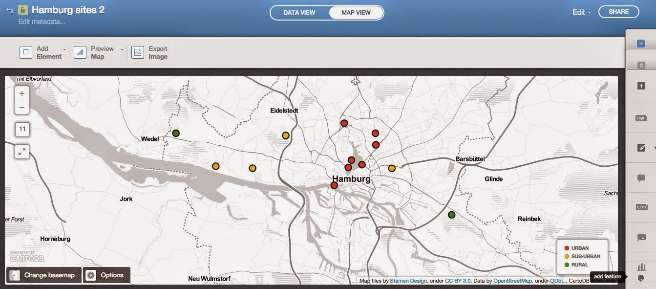 |
| A quick and simple visualisation of my sites in Hamburg |
The most useful
tools I found were using category to show types of sites in different
colours, and cluster to make the marker size proportional to the data
for that point (ie. the number of species collected at each site).
They also have a
number of nice looking base maps (some of which looks like great
boardgames!) but there is not much flexibility as to what is included
on that map. Which brings me to…
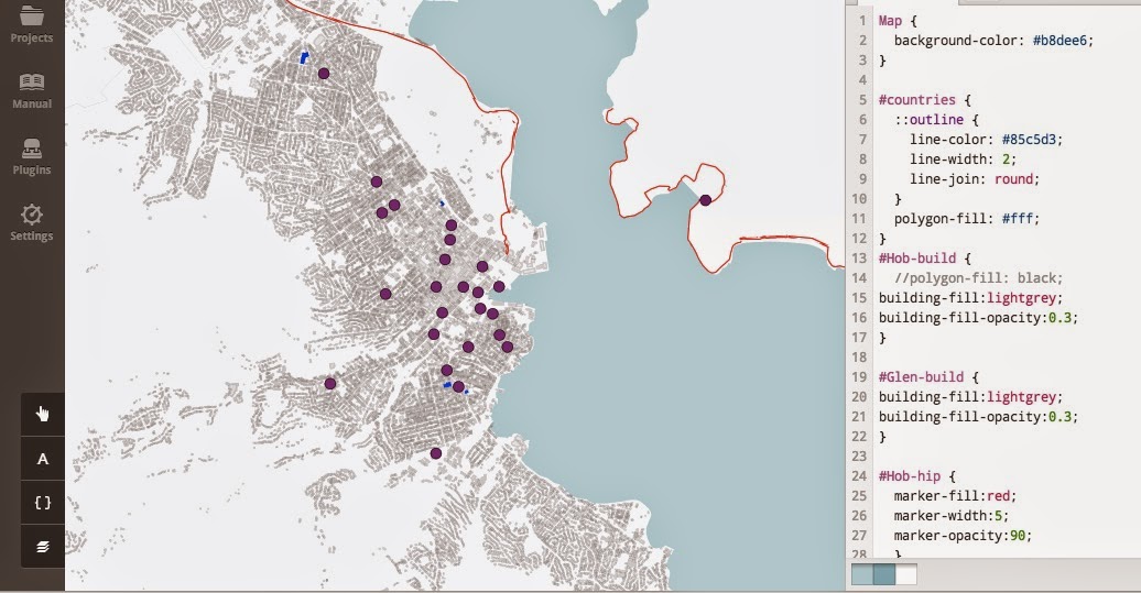
Tilemill
What is it?
Tilemill is software that will allow you to build your own maps from the bottom up, a little more difficult to use but much better for custom designing maps which include the data you want (ie. you choose which layers you want for the base map).
How does it work?
Once you've downloaded Tilemill the hardest thing is acquiring the data that you want and getting it in to Tilemill. I'm not going to go through all the steps because I'm not 100% sure I know how I did it myself.
But what I can tell you is that I was so excited to actually get some data in and make it do what I wanted. Suddenly I could change the thickness of roads and the colour of parks and add in the locations of all the local pubs (that's right, very useful stuff).
It may not look like much but and I managed to input the built up areas of Hobart, highlight the supermarkets, mark the pubs and follow the bike paths.
And one of the best places to get data (roads, shops, buildings ect.) is OpenStreetMap...
OpenStreetMap
What is it?
I really can't believe that I had never heard of this before my week at ResBaz, I've been way too tied up in the world of google and it's good to get out!
The name says it all really,
OpenStreetMap is like wikipedia for maps, anyone can input or modify the data and it's open for anyone to use.
How does it work?
It's a lot like google maps, in that you can look at the area you're interested in and see all the features such as roads, cafes, even individual trees in some cases.
But it's BETTER than google maps because you can actually export this data to use in your own maps. Select an area or use a range of free download servers like
geofabrik to export the data.
AURIN
What is it?
How does it work?
It's quite easy to find the data you're interested in, you just choose an area and use the dataset button to search for and download data.
Once you have a few data sets, you can merge them using the tools button (just make sure the data uses the same areas) and map them using the visualise tools. There are also lots of other analytical tools that I haven't had a chance to try out yet.
This map shows where you can get to by walking 800m from train stations in Melbourne, with colours that represent the quality of the surrounding matrix (ie. does the area contain shops, schools and transport hubs or just industrial buildings).
This is such a great tool, I'm really excited to start using it for my research. And hopefully they get more funding and are able to expand to include some more ecological data in the future! If we could include biodiversity data into something like this it would be a big step forward for urban ecology in Australia.